How to Check Standard Dashboards
Prerequisites
We assume you have all prerequisites you may need, including:
- If needed: the VPN is configured to access the Finmars resources
- If needed: access to the Virtual Machine to work with the sensitive information
- Must have: registered in Finmars in the needed region environment (self-registered or registered by Finmars)
- Must have: having permissions set to allow continue with the Action in the Guide
Checking Standard Dashboards
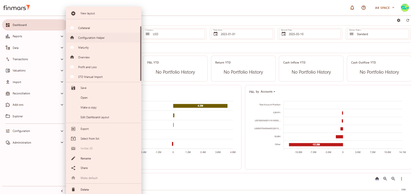
- Go to the Dashboard tab in the left-side menu.
- At the top of the page (next to the save icon), you will see the current dashboard layout name (it can differ from user settings). Click on this name to open the dropdown menu listing all available layouts.

- From this dropdown, select the standard dashboard you want to check.
- Below you can find an overview of Standard Dashboard Layouts


Overview Layout
Overview – Displays a high-level summary of key financial metrics like NAV, P&L, cash flows, and balance trends
Filter Panel
At the top of the Overview layout, you'll find the filter panel where you can adjust key parameters:
- Portfolios – Select which portfolios to display data for.
- Currency – Choose the reporting currency.
- Date From / Report Date – Define the time period for analysis. The Report Date will always display the balance as of the end of the selected day.
- Pricing Policy – Set the method for asset valuation.
Below the filter panel, there is a summary section displaying key financial metrics: NAV YTD, P&L YTD, Return YTD, Cash Inflow/Outflow YTD
Cards
Cards values are based on calculated Portfolio History for selected parameters in Filter Panel.
Balance by Accounts
Displays a bar chart of the portfolio's asset balances by account.
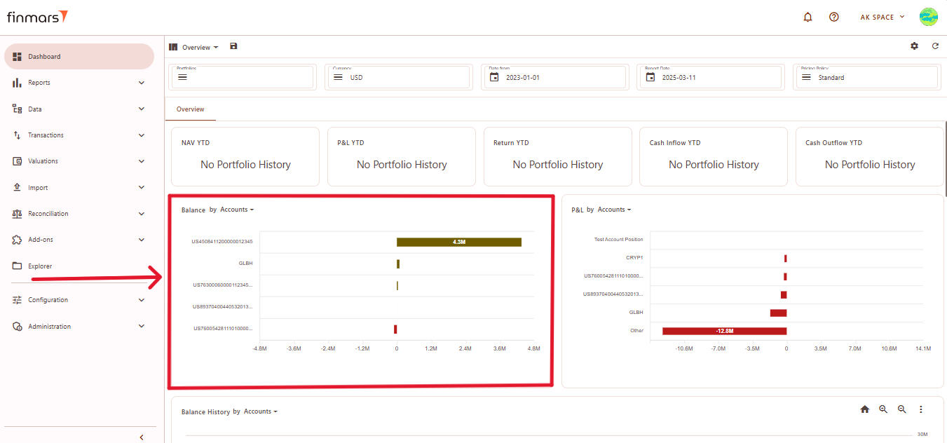
Elements:
The chart always displays the first five categories. If there are more than five elements, the remaining data are grouped under the Other category, which aggregates all additional positions. In this case, the Other category sums up the elements beyond the first five displayed.
The X-axis always represents numerical values, typically amounts or prices, while the Y-axis represents categories.
P&L by Accounts
Displays a bar chart showing the profit and loss distribution across different accounts.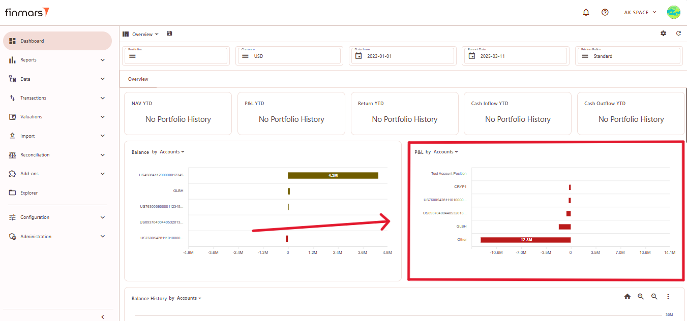
Elements:
The chart always displays the first five categories. If there are more than five elements, the remaining data are grouped under the Other category, which aggregates all additional positions. In this case, the Other category sums up the elements beyond the first five displayed.
The X-axis always represents numerical values, typically amounts or prices, while the Y-axis represents categories.
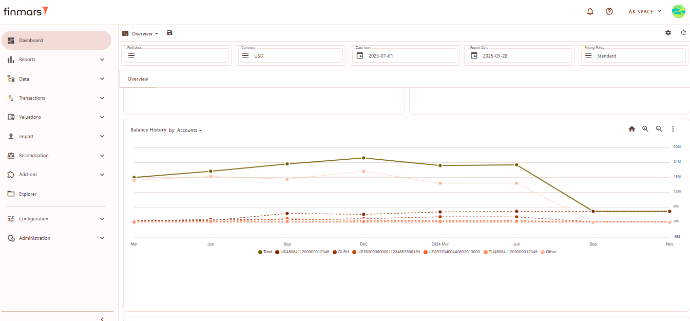
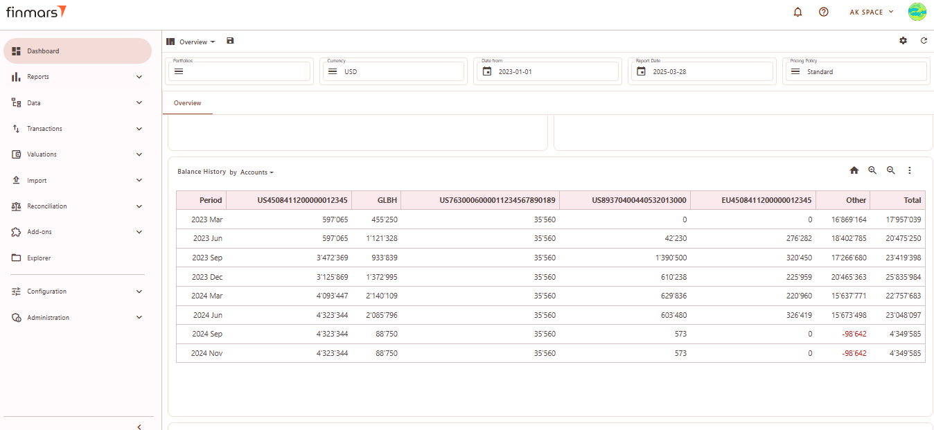
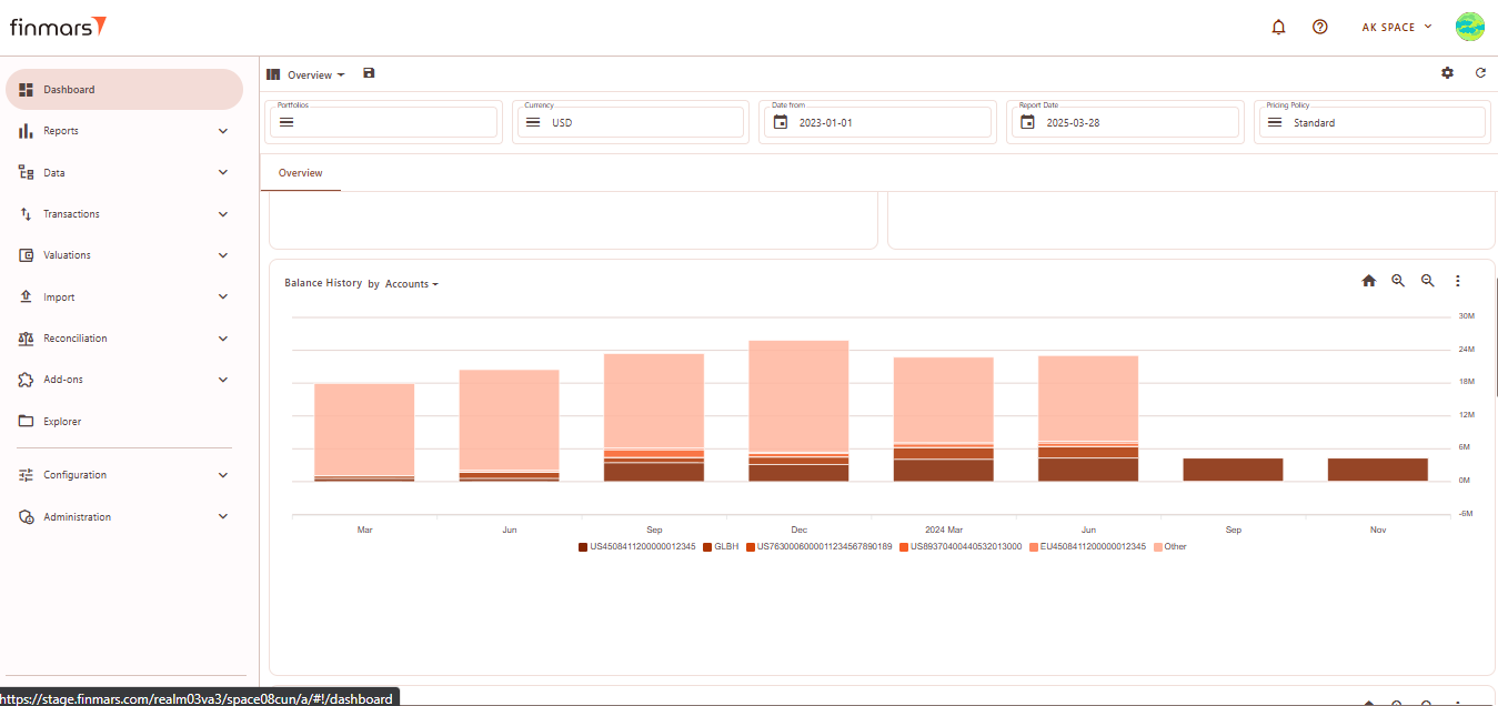
Balance History by Accounts
This section visualizes the historical changes in asset balances over time. The chart helps track trends in portfolio values, showing fluctuations across different accounts.
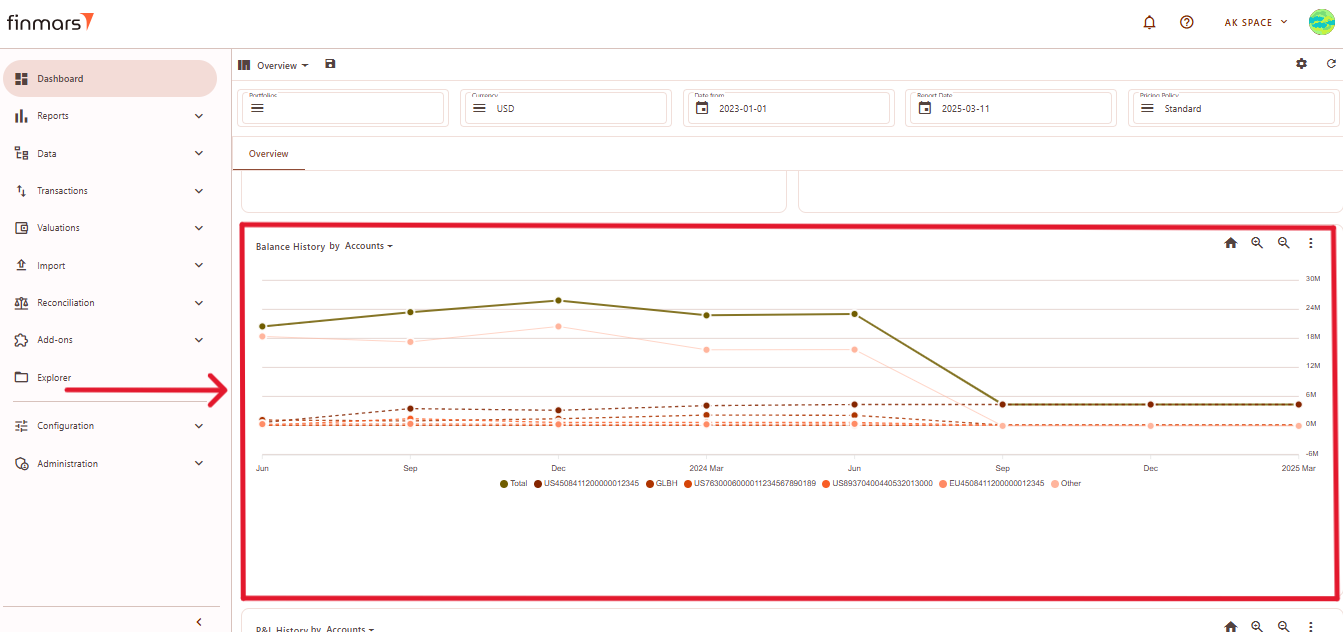
Elements:
- Time Axis (X-Axis) – Displays a timeline, illustrating changes in balances over time.
- Value Axis (Y-Axis) – Represents balance amounts, showing increases or decreases across different accounts.
- Colored Lines – Each account has a unique color, distinguishing different balance trends.
- Solid and Dotted Lines – Solid lines represent total balances or major accounts, while dotted lines indicate smaller accounts.
- Legend – Located at the bottom, mapping each color to its corresponding account.
- Trend Patterns – Some accounts show gradual changes, while others exhibit sharp declines, indicating significant balance shifts.
You can select category for a graph
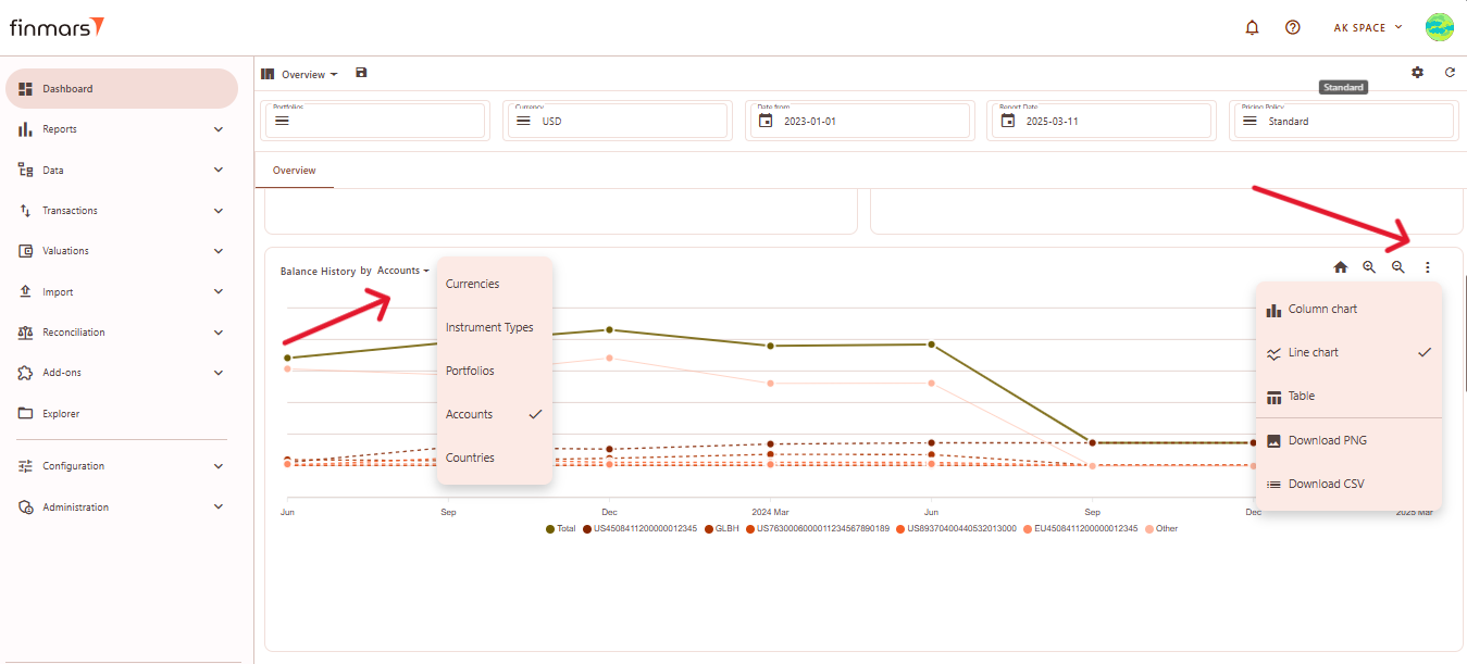
Chart Type Options:
- Column Chart – Displays historical balances as bar charts.

- Line Chart (default) – Shows trends over time with connected data points.
- Table – Converts the visual chart into a tabular format for numerical analysis.


Download Options:
- Download PNG – Saves the chart as an image file.
- Download CSV – Exports balance history data as a CSV file for further analysis.
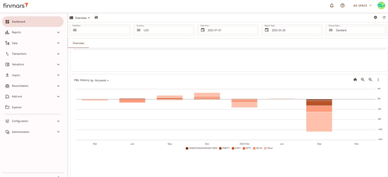
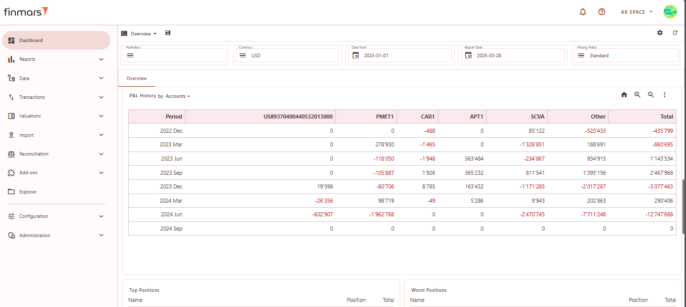
P&L History by Accounts
This module visualizes the historical changes in profit and loss (P&L) over time, allowing users to track financial performance trends across different accounts.
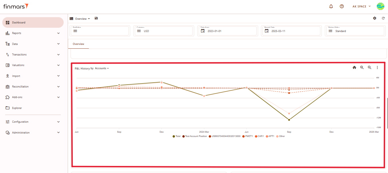
Elements:
- Time Axis (X-Axis) – Displays a timeline, illustrating changes in profit and loss over time.
- Value Axis (Y-Axis) – Represents profit and loss values, indicating financial performance across different accounts.
- Colored Lines – Each account is assigned a distinct color to differentiate financial trends.
- Solid and Dotted Lines – Solid lines represent total P&L movements, while dotted lines indicate individual accounts.
- Legend – Located at the bottom, linking each color to its corresponding account.
- Trend Patterns – Some accounts show steady performance, while others display sharp fluctuations, highlighting significant changes in financial results.
You can select category for a graph
Chart Type Options:
- Column Chart – Represents P&L data using vertical bars.

- Line Chart (default) – Shows P&L trends over time using connected data points.
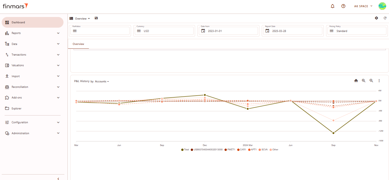
- Table – Converts the graph into a tabular format for numerical analysis.


Download Options:
- Download PNG – Saves the chart as an image file for reporting purposes.
- Download CSV – Exports the P&L history in a CSV format for further analysis in spreadsheets.
Top Positions
Lists the best-performing holdings by total value.
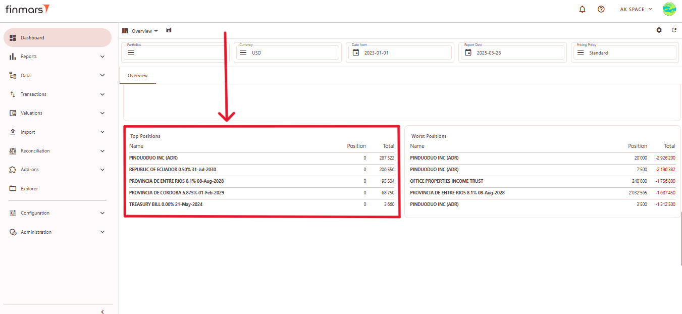
- Name – The name of the financial instrument.
- Position – The number of units held.
- Total – The total market value of the position.
Worst Positions
Displays the weakest-performing assets, highlighting losses.
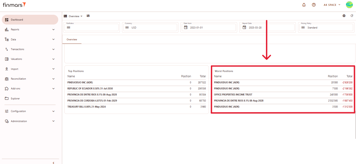
- Name – The name of the financial instrument.
- Position – The number of units held.
- Total – The total market value of the position, often displayed in red to indicate negative performance.
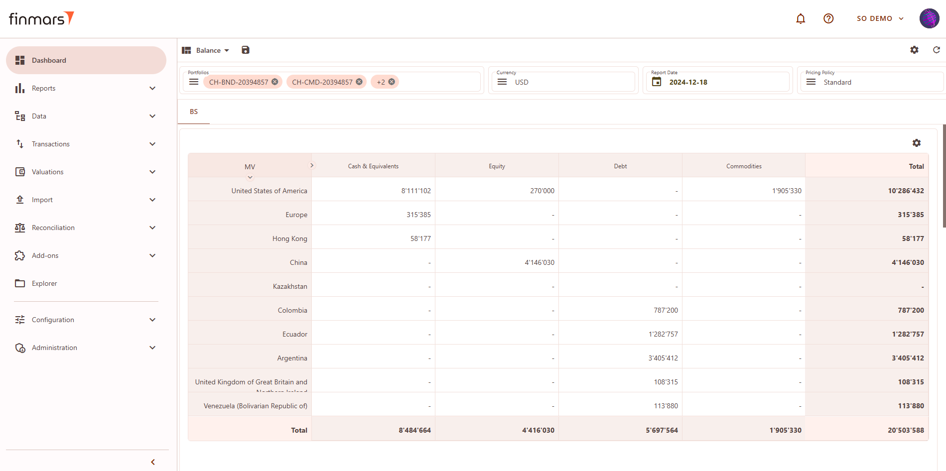
Balance Sheet (BS) Layout
The Balance Sheet (BS) layout provides an overview of asset distribution by different categories, such as countries, accounts, or asset types.
Filter Panel
At the top of the BS layout, the filter panel allows for the adjustment of key parameters:
- Portfolios – Select which portfolios to analyze.
- Currency – Choose the reporting currency.
- Report Date – will always display the balance as of the end of the selected day.
- Pricing Policy – Determines the valuation method for instruments.
Matrix
Matrix Component Editor
To customize the BS matrix, users can access the Matrix Component Editor by clicking on the settings icon in the top-right corner. The editor allows modifications to the data structure.
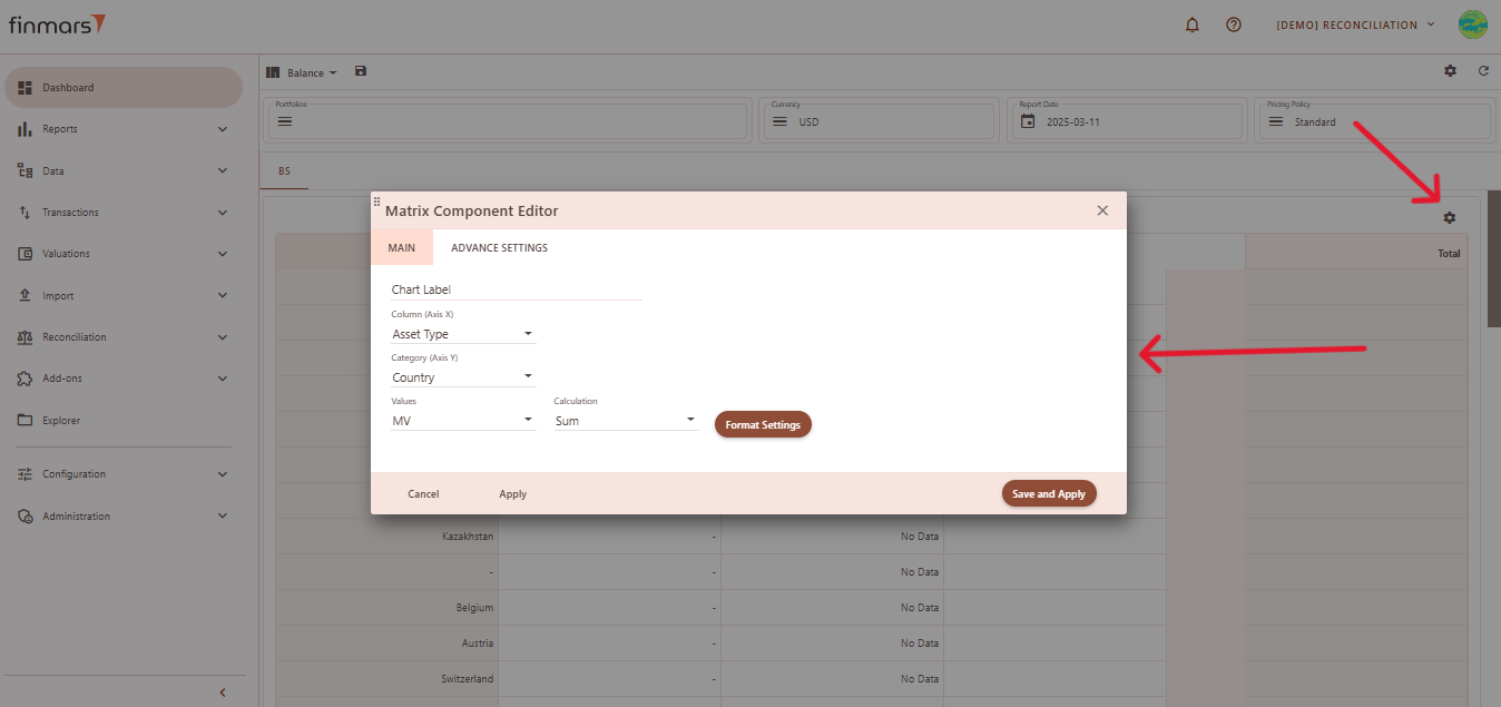
Customization Options:
- Main Tab
- Chart Label
- Column (X-Axis) – Defines default grouping criteria.
- Category (Y-Axis) – Selects default secondary grouping level.
- Values – Defines the key metric displayed in the table.
- Calculation Method – Determines how values are calculated:
- Sum – Aggregates total values.
- Weighted Market Value – Adjusts MV based on weighting.
- Weighted Market Value Percent – Displays MV as a percentage.
- Weighted Exposure – Adjusts exposure levels.
- Weighted Exposure Percent – Displays exposure as a percentage.
- Advanced Settings Tab
- ***
Balance Report
Linked to Matrix, if you click on matrix cell it will show related Balance Items. Details on use see in How to Check Balance Report
Linked Filters:
***
Transaction Report
Linked to Balance Report, if you click on Balance Item it will show related Transactions. Details on use see in ***
Linked Filters:
***
Profit & Loss Layout
The P&L layout provides an overview of financial performance across different regions
Filter Panel
At the top of the P&L layout, you'll find the filter panel where you can adjust key parameters:
- Portfolios – Select which portfolios to analyze.
- Currency – Choose the reporting currency.
- Date From / Report Date – Define the time period for analysis. The Report Date will always display the balance as of the end of the selected day.
- Pricing Policy – Determines the valuation method for instruments.
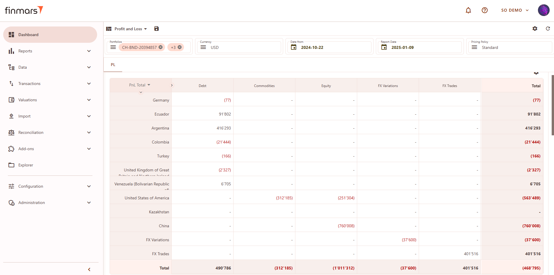
The main P&L table presents financial performance per region:
- PnL Total – Displays total profit or loss per region.
- FX Variations – Reflects changes due to currency fluctuations.
- FX Trades – Captures executed foreign exchange transactions.
- Total – Summarizes the overall P&L per region
Matrix Component Editor (P&L)
To customize the P&L matrix, click the settings icon in the top-right corner. This editor allows modifications to the displayed data.
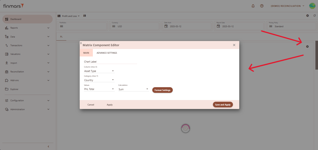
Customization Options:
- Column (X-Axis) – Groups data by Asset Type, Country, Account, Portfolio, or PL Group.
- Category (Y-Axis) – Secondary grouping by Country, CCY, Account, Asset Type, or Portfolio.
- Values – Displays PnL Total (profit and loss) or MV (Market Value).
- Calculation Method – Defines how values are calculated:
- Sum – Total aggregation.
- Weighted Market Value – Adjusts MV by weighting.
- Weighted Market Value Percent – MV as a percentage.
- Weighted Exposure – Adjusted exposure levels.
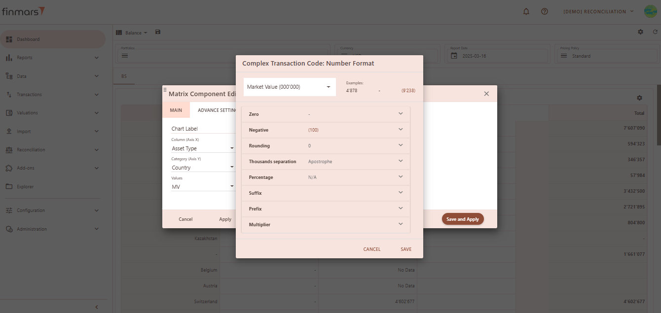
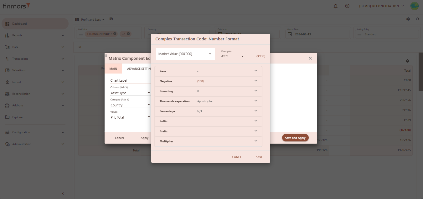
- Format Settings:
- Zero Formatting: Defines how zero values appear (as "0", "-", or blank).
- Negative Formatting: Determines how negative numbers are displayed (e.g., with a minus sign or in parentheses).
- Rounding: Sets the number of decimal places shown.
- Thousands Separator: Chooses how large numbers are formatted (e.g., using an apostrophe, space, or no separator).
- Percentage: Decides if numbers should be displayed as percentages and in what format.
- Suffix & Prefix: Allows adding custom text before or after numbers (e.g., currency symbols).
- Multiplier: Adjusts the scale of numbers (e.g., displaying in thousands or millions).
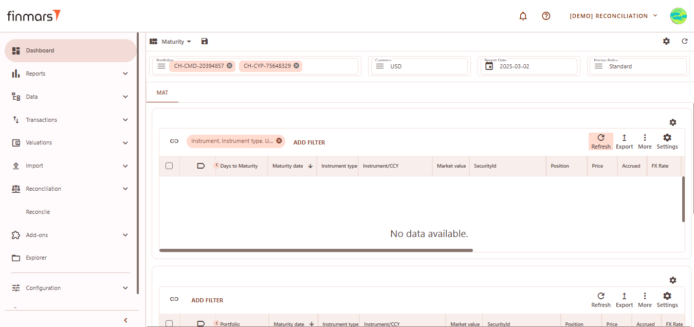
Maturity Layout
Maturity layout provides insights into financial instruments based on their maturity dates.
Filter Panel
At the top of the Maturity layout, you'll find the filter panel where you can adjust key parameters:
-
- Portfolios – Select which portfolios to analyze.
- Currency – Choose the reporting currency.
- Report Date – will always display the balance as of the end of the selected day.
- Pricing Policy – Determines the valuation method for instruments.
- Upper Section – Displays instruments sorted by maturity, including days to maturity, date, type, market value, price, position, and FX rate.
- Lower Section – Similar to the upper table but filtered by portfolio.
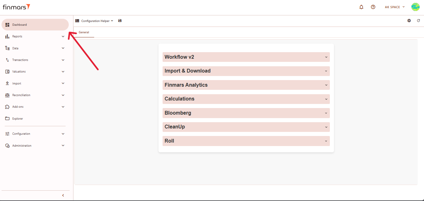
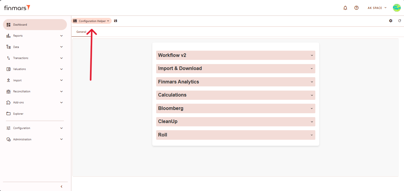
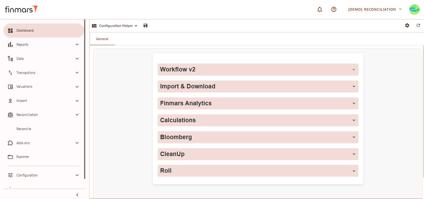
Configuration Helper Layout
The Configuration Helper layout provides various system tools for managing workflows, performing calculations, importing/exporting data, and running analytics.
General Tab
The Configuration Helper layout contains sections with workflows. Each workflow includes a description and tooltips for fields. Below is an overview of its sections:
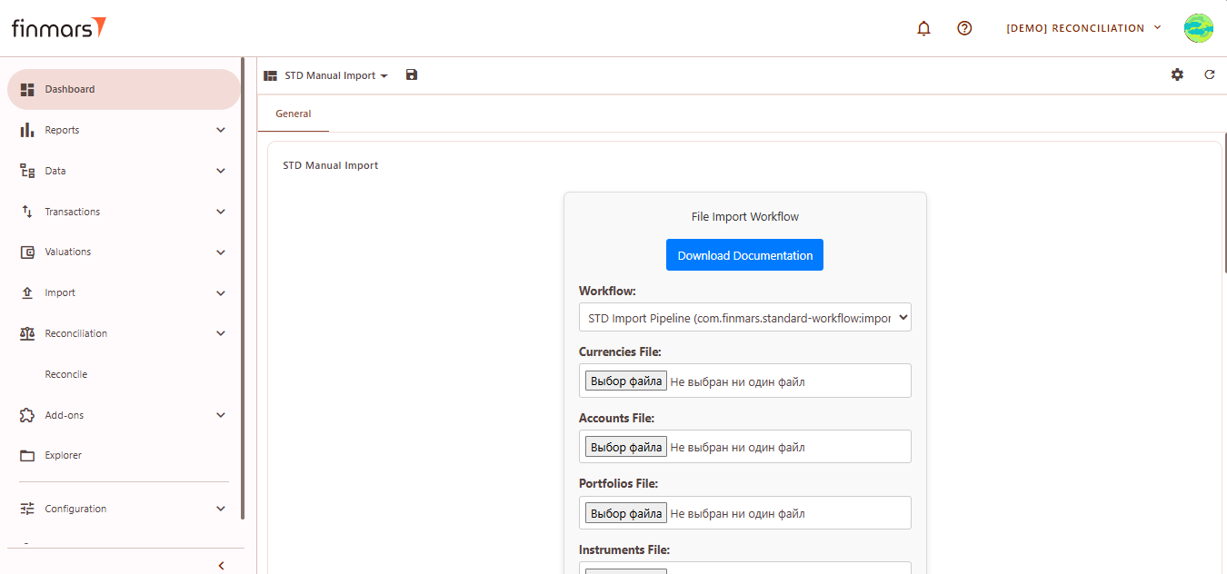
STD Manual Import Layout
The STD Manual Import layout provides a structured interface for manually uploading key financial data files into the system.
See How to Import Data into a Workspace via Dashboard (STD Manual Import)