Add Pie Chart to Your PDF Report
In this article you will learn how to add various charts to your PDF Report. Lets start!
So, you have your canvas, lets drop new block there Python Plot Chart
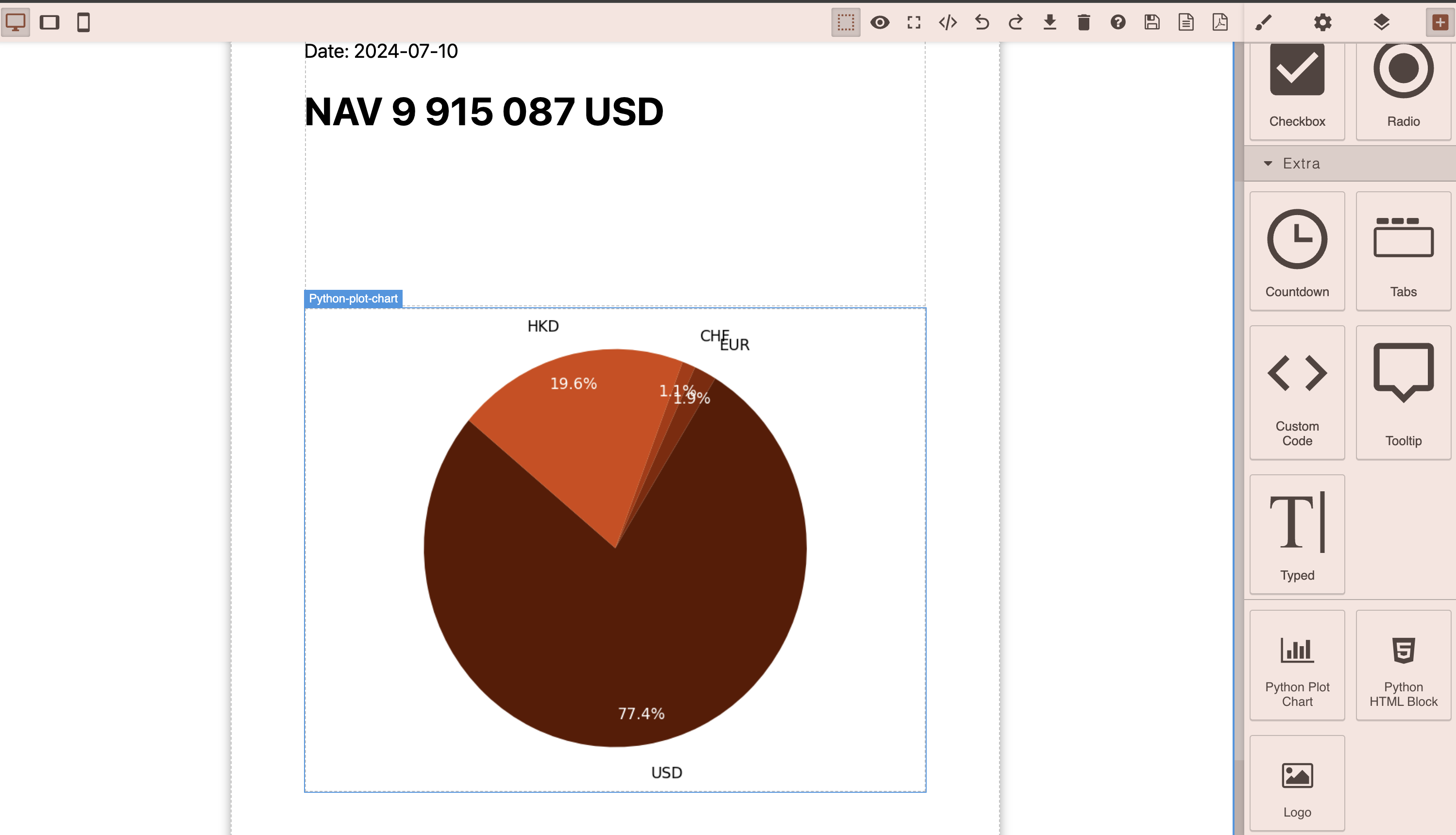
Logic absolutely the same as with Python HTML Block, the only difference that we expect from Python Plot Chart an Image as output
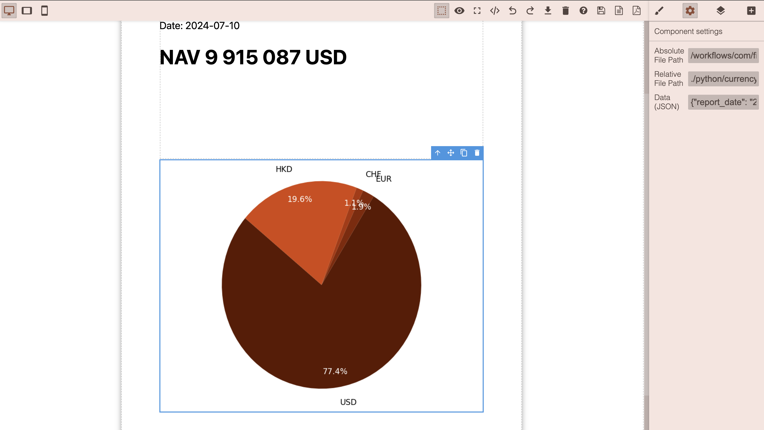
In settings Panel same options and same rules as for Python HTML Block
Lets see what is inside of codecode. Open ./python/currency_pie_chart.ipynb
import matplotlib.pyplot as plt

import requests
import datetime
from datetime import timedelta

from workflow.finmars import utils, request_api


if 'execution_context' not in locals():
    execution_context = {}

report_date = execution_context.get('report_date', '2023-08-12')
portfolio = execution_context.get("portfolio", "Bonds Portfolio")
report_currency = execution_context.get('report_currency', 'USD')
pricing_policy = execution_context.get('pricing_policy', 'com.finmars.standard-pricing:standard')

period_type = execution_context.get('period_type', 'ytd')

category_key = 'exposure_currency.user_code'
value_key = 'market_value'

payload = {
    "cost_method": 1,
    "pricing_policy": pricing_policy,
    "report_date": report_date,
    "report_currency": report_currency,
    "portfolios": [portfolio],
    "frontend_request_options": {
        "columns": [],
        "filter_settings": [],
        "groups_types": [],
        "groups_values": []
    }
}


response = request_api(f'/api/v1/reports/backend-balance-report/items/', method='POST', data=payload)

items = response["items"]

labels = []
sizes_dict = {}
sizes = []

for item in items:

    if item[category_key] not in labels:
        labels.append(item[category_key])

    if item[category_key] not in sizes_dict:
        sizes_dict[item[category_key]] = 0

    sizes_dict[item[category_key]] = sizes_dict[item[category_key]] + item[value_key]

# print(labels)

# Mock data
# labels = ['USD', "CHF"]
# sizes = [80, 20]
colors = ['#5d1800', '#842400', '#ad3301', '#d5450a', '#f85f26', '#ff8b65']
# print(sizes_dict)

for key, value in sizes_dict.items():
    sizes.append(value)

# # Create a pie chart
plt.figure(figsize=(8,6))
wedges, texts, autotexts = plt.pie(sizes, labels=labels, colors=colors, autopct='%1.1f%%', startangle=140,     labeldistance=1.15,  # Distance of labels from the center of the pie
    pctdistance=0.85)    # Distance of the percentage text from the center)

for text in texts:
    text.set_fontsize(14)
    text.set_color('black')

# Set the font size and color for the percentage labels
for autotext in autotexts:
    autotext.set_fontsize(14)
    autotext.set_color('white')

plt.axis('equal')  # Equal aspect ratio ensures that pie is drawn as a circle.

# # Show the plot
plt.tight_layout()  # Adjust layout to make room for rotated labels
plt.show()
Code is similar to what we have seen before, only principal change is
import matplotlib.pyplot as plt
So, we use Matplotlib for charts (https://matplotlib.org/) Import it
After we fetched and prepared data, we need to configure our Plot
# Create a pie chart
plt.figure(figsize=(8,6))
wedges, texts, autotexts = plt.pie(sizes, labels=labels, colors=colors, autopct='%1.1f%%', startangle=140,     labeldistance=1.15,  # Distance of labels from the center of the pie
    pctdistance=0.85)    # Distance of the percentage text from the center)

for text in texts:
    text.set_fontsize(14)
    text.set_color('black')

# Set the font size and color for the percentage labels
for autotext in autotexts:
    autotext.set_fontsize(14)
    autotext.set_color('white')

plt.axis('equal')  # Equal aspect ratio ensures that pie is drawn as a circle.
Pass data, other settings, when you ready then do:
# Show the plot
plt.tight_layout()  # Adjust layout to make room for rotated labels
plt.show()