White Label Documentation
This documentation provides a comprehensive guide to our White Label capabilities. It covers an overview of our projects, in-depth customization options (such as favicon, logos, and CSS modifications), and the theming functionality available through our UI kit. Designed for analysts and their assistants, this guide ensures a clear understanding of both the architecture and practical implementation of our White Label system.
- Project Overview
- Portal (Angular.js)
- vue-portal (Nuxt 3, Vue 3)
- workflow-portal (Nuxt 3, Vue 3)
- authorizer-portal (Nuxt 3, Vue 3)
- UI Kit (Vue 3)
- White Label Customization Capabilities
- Favicon
- Logos (Light & Dark Versions)
- CSS Customization (Predefined File vs. Custom CSS)
- Default Settings
- Multiple White Label Items
- Marketplace Configuration
- Import/Export Functionality
- Theming in the UI Kit
Project Overview
This chapter provides an in-depth look at all our projects. It outlines the technology stack, routing schemes, and the extent to which each project integrates the UI kit. Understanding these fundamentals is crucial for appreciating how White Label is implemented across different platforms.
Portal (Angular.js)
- Technology: Angular.js
- Route:
/<realm>/<space>/a/#!/ - UI Kit Integration: 3%
- Details:
This portal is the main application developed using Angular.js. It provides basic functionality for users and utilizes the UI kit minimally to standardize the appearance.
vue-portal (Nuxt 3, Vue 3)
- Technology: Nuxt 3 (based on Vue 3)
- Route:
/<realm>/<space>/v/ - UI Kit Integration: 30%
- Details:
The vue-portal is a modern web application built with Nuxt 3 and Vue 3. It offers enhanced functionality and deeper integration with the UI kit, ensuring a flexible and rich user experience.
workflow-portal (Nuxt 3, Vue 3)
- Technology: Nuxt 3 (based on Vue 3)
- Route:
/<realm>/<space>/w/ - UI Kit Integration: 0%
- Details:
Part of web application built with Nuxt 3 and Vue 3. For illustrate workflow and create scripts for flow/
authorizer-portal (Nuxt 3, Vue 3)
- Technology: Nuxt 3 (based on Vue 3)
- Route:
/v/ - UI Kit Integration: 10%
- Details:
This portal is designed for authorization processes. Developed using Nuxt 3 and Vue 3, it features minimal UI kit integration to provide basic styling and functionality focused on security and ease of access.
UI Kit (Vue 3)
- Technology: Vue 3
- Details:
The UI kit is a collection of ready-made components and styles developed in Vue 3, ensuring a consistent appearance across all projects. It is used to style interface elements and supports theming through variables and abstract palettes.
White Label Customization Capabilities
This chapter outlines the full range of customization options available through our White Label system. It covers everything from minor visual updates (like favicon changes) to extensive modifications via custom CSS. In addition, it explains default settings, the creation of multiple configuration items, and integration with the Marketplace.
Favicon
- What is a Favicon:
A favicon is a small icon that appears in the browser tab, bookmarks, and history alongside the website title. - Purpose:
Changing the favicon helps align the application with the customer’s brand, boosting brand recognition. - How to See Changes:
After replacing the favicon, refresh the browser page to view the updated icon in the tab header and bookmarks.
Logos (Light & Dark Versions)
- Overview:
The application supports two versions of the logo:- Light Logo: Used with a light theme.
- Dark Logo (Logo dark): Optimized for a dark theme.
- Purpose:
Separate logos ensure that the branding remains clear and visually appealing regardless of the selected theme. - Display Location:
Both logos appear in the upper left corner of the application and automatically switch based on the active theme.
CSS Customization (Predefined File vs. Custom CSS)
- Options:
Users can choose between:- Predefined CSS File: A ready-made file containing all custom styles.
- Custom CSS Field: An integrated code editor for directly entering CSS code.
- Step-by-Step Process:
- Identify the Required Selector or Variable:
- Open the application in your browser.
- Right-click the target element and select “Inspect Element” (or “View Code”) to open DevTools.
- Locate the relevant CSS selector or variable.
- Test Changes in DevTools:
- Modify the CSS in DevTools to preview changes in real time.
- Apply the Changes:
- For permanent updates, either upload the modified CSS file or paste the new code into the Custom CSS field.
- Verify the Result:
- Save the changes and refresh the page to ensure the new styles are applied correctly.
- Identify the Required Selector or Variable:
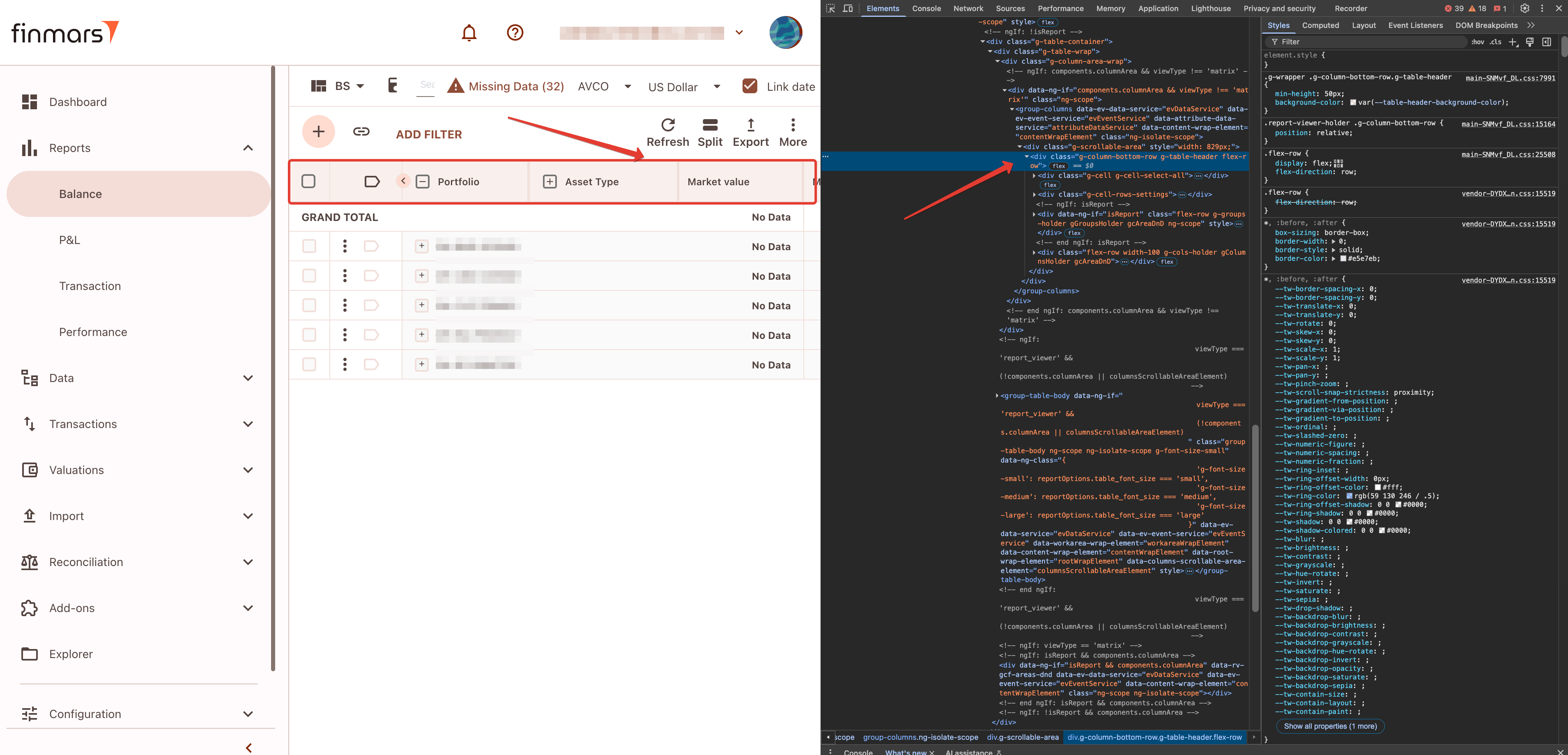
Below is an illustrated example of the CSS Customization Step-by-Step Process:
-
Objective:
In this example, we will change the color of the table header.
-
Locate the Element:
Find the target element in the element tree.
(Right-click on the target element and select "Inspect Element" (or "View Code") to open DevTools.)
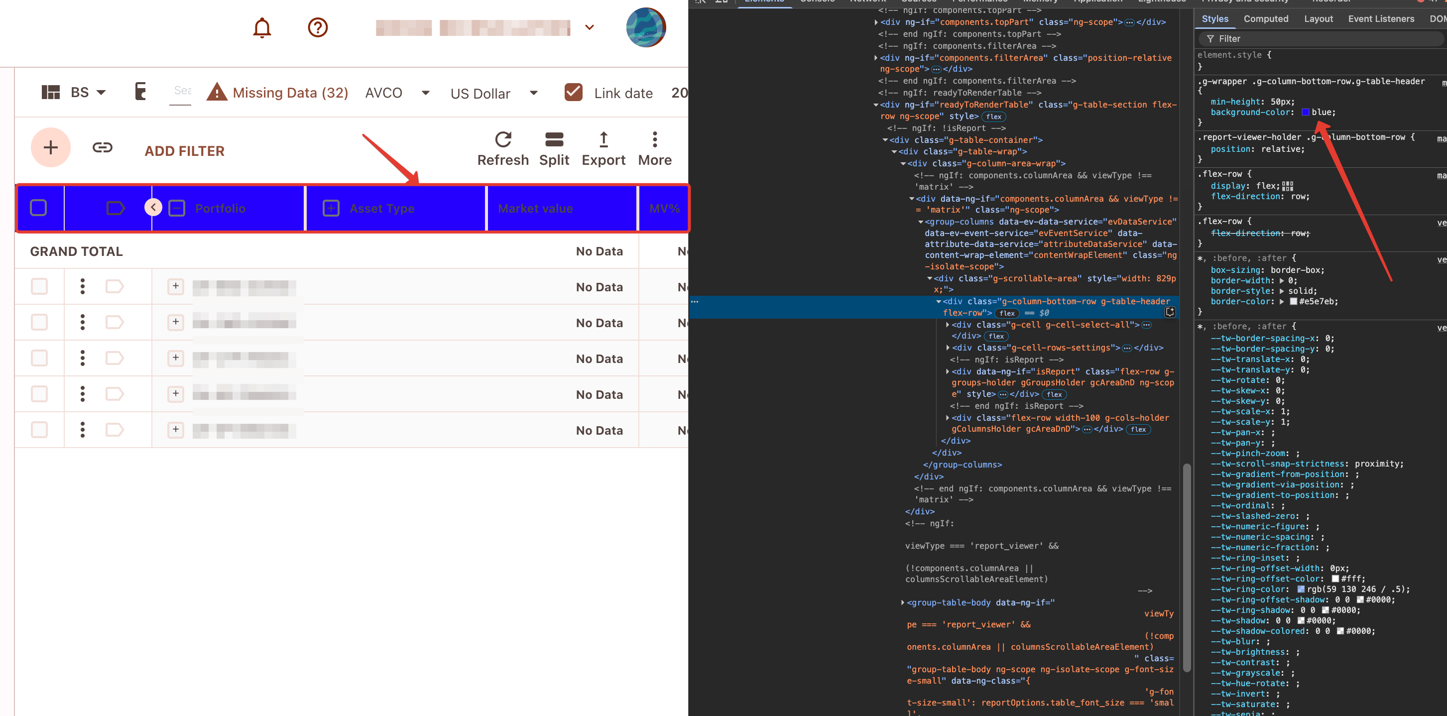
-
Identify the Style and Selector:
Look for the style that applies the current color to the element, and note the corresponding selector.
Test different colors directly in DevTools until you select the desired one.
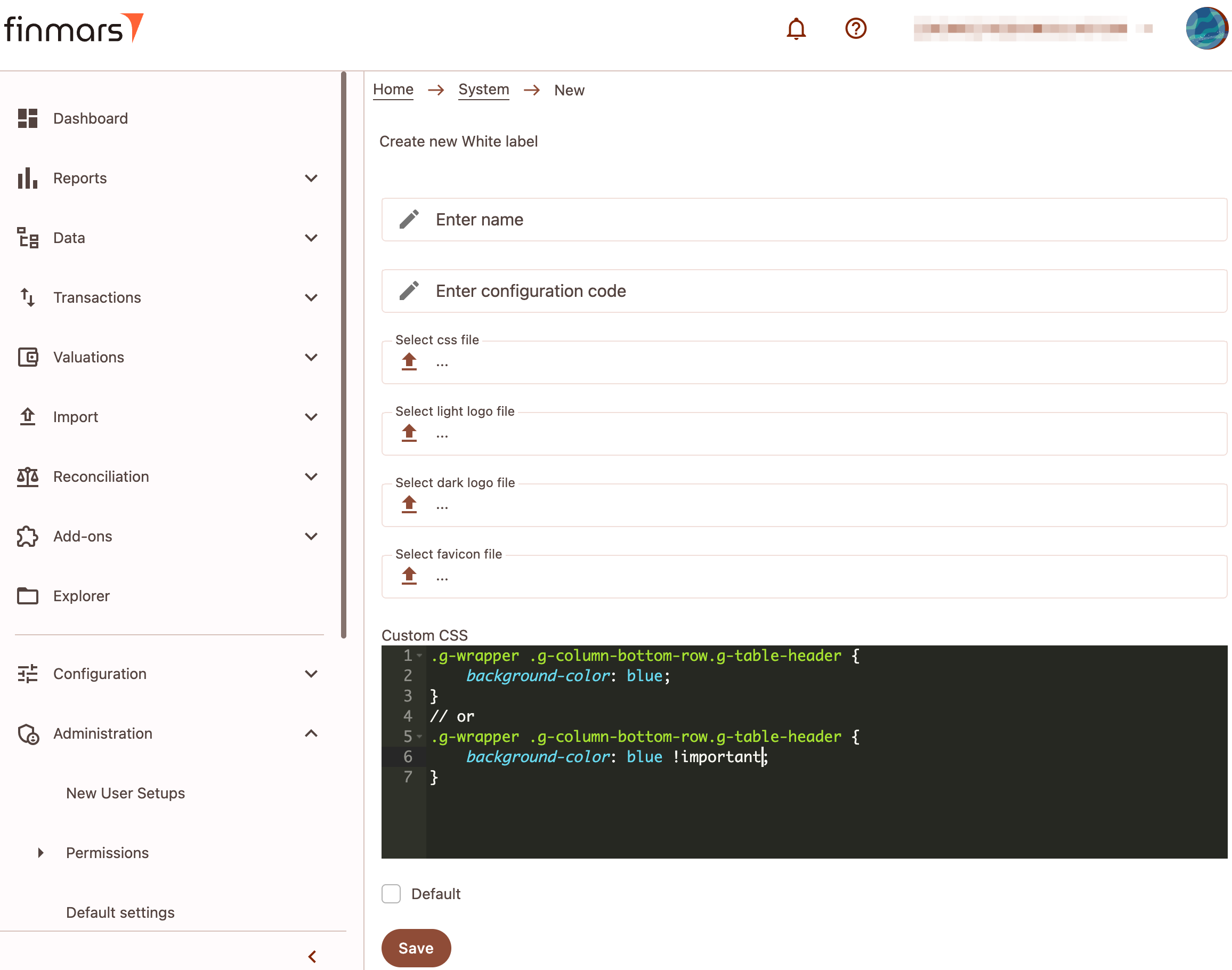
-
Apply the Changes:
Once the color is finalized, copy the selector and the new style into your CSS file or the Custom CSS field.
-
Enhance Specificity if Needed:
In some cases, to ensure your style takes precedence, add the!importantdeclaration to the property.

Default Settings
Explanation:
The "Default" field indicates that the specific White Label item is applied by default. If no alternative configuration is selected, these settings will automatically be active, ensuring a baseline level of customization.
Multiple White Label Items
Flexibility:
Our system supports the creation of an unlimited number of White Label items. This allows for tailored configurations for different brands or projects, providing maximum flexibility.
Marketplace Configuration
- Overview:
White Label items can be further configured for publication in the Marketplace, allowing reuse across various projects. - Instruction:
Publishing a module in Finmars Marketplace
The module publication process in Finmars Marketplace consists of two parts:
-
Adding the module to Finmars Marketplace
-
Adding the module to Finmars Space
Adding the module to Finmars Marketplace
-
Open the Finmars Marketplace Admin Panel at: https://marketplace.finmars.com/admin/
-
Go to the Configurations section.
-
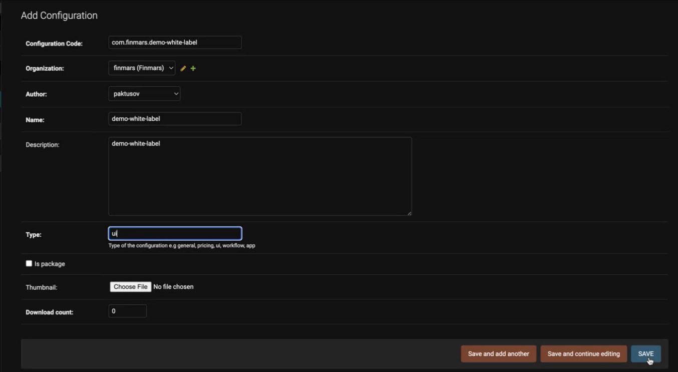
Click the "Add Configuration" button.
-
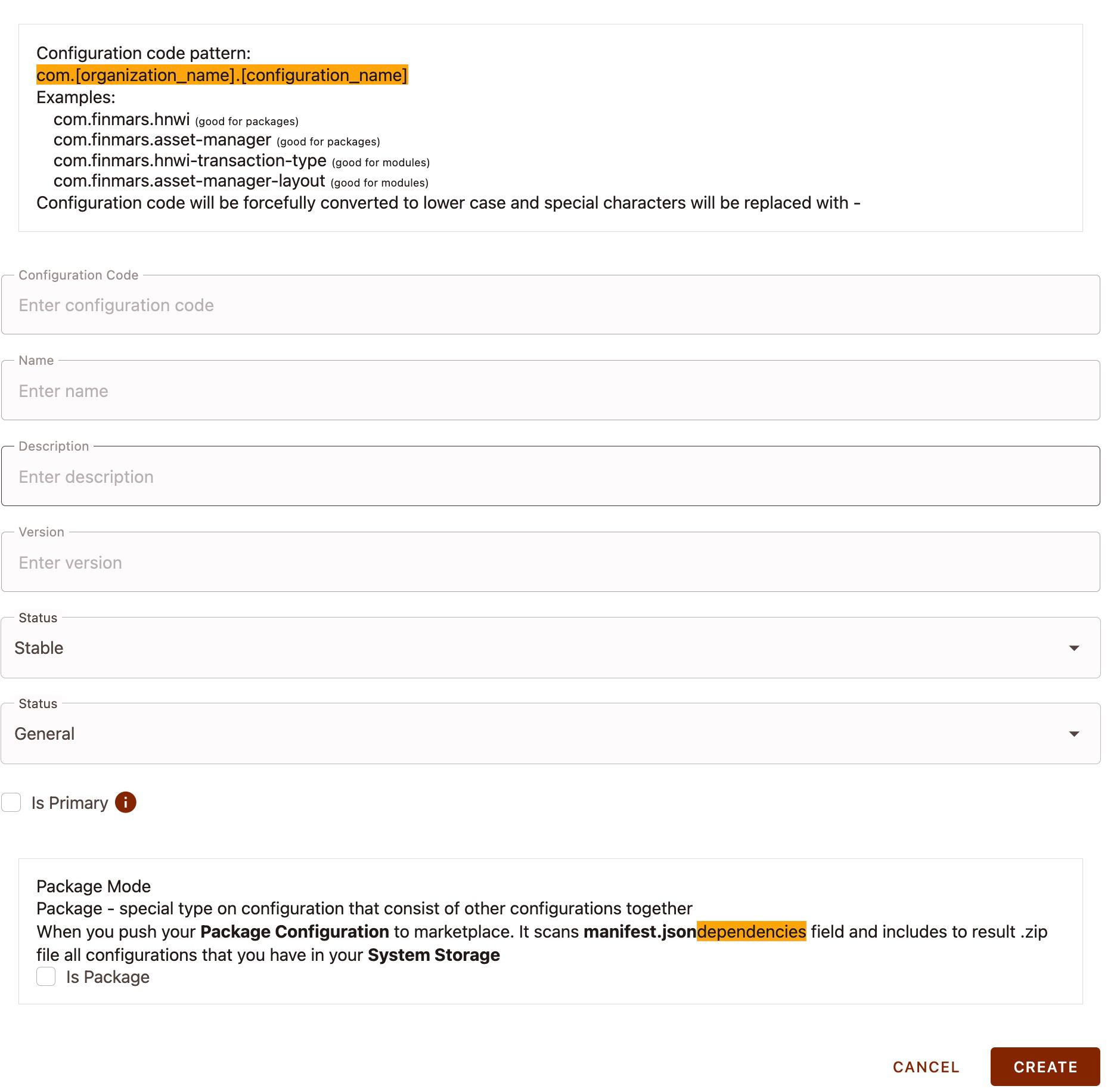
Fill out the form with the following details:

Configuration Code – The one defined at the beginning.
Organization – Your organization.
Author – The author of the module.
Name – The module name.
Description – The module description.
Type – The module type (general,ui,app,workflow,pricing).
Is package – Whether the module is a package (true/false).Adding the module to Finmars Space
-
Open Space.
-
Navigate to Configuration → Configuration → Manage:
https://{domain_name}/{realm_code}/{space_code}/v/configuration/manage-configuration -
Click "Add New Configuration".
-
Fill out the form with the following details:

Configuration Code – The one defined at the beginning.
Name – The module name.
Description – The module description.
Version – In the formatX.X.X, whereXis an integer.
Is package – Whether the module is a package (true/false). -
Open the newly created module and click "Export to storage".
-
Verify the export result using Explorer. The files should be located at:
configurations/custom/{configuration_code}/{version}/ -
Click "Push Configuration to Marketplace".
After publishing, the module should appear in Add-ons → Marketplace:
https://{domain_name}/{realm_code}/{space_code}/v/marketplace⚠️ If your module is not a package, make sure to enable the "Show Modules" option.
-
Import/Export Functionality
- Overview:
The import/export feature facilitates the transfer of White Label configurations between projects, enabling backup creation and sharing. - Instruction:
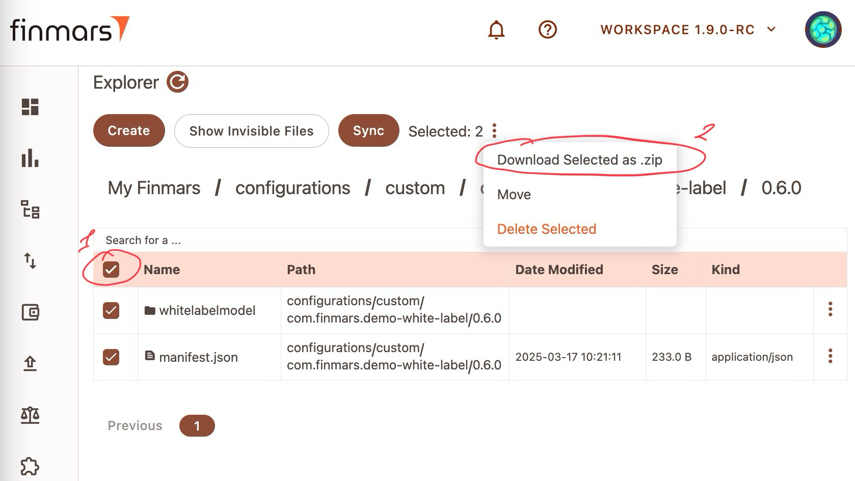
Export a configuration:
-
Follow the instructions from How to publish a module in Marketplace in the section "Adding the module to Finmars Space", up to Step 6.
-
Open Explorer and navigate to:
configurations/custom/{configuration_code}/{version}/ -
Select all files and folders.

-
Click on the three vertical dots. A dropdown menu will appear.
-
In the dropdown menu, select "Download Selected as .zip".
Import a configuration:-
Navigate to Configuration → Configuration → Import.
-
Upload the configuration file.
-
Theming in the UI Kit
This chapter delves into the theming capabilities of our UI kit. It explains how design palettes are abstracted using CSS variables, outlines the process for creating and integrating new palettes, and provides guidelines for testing and deployment.
Palette Abstraction
- Overview:
For each White Label item, a design palette is created—a set of CSS variables that encapsulate the customer’s brand colors and styling. - Examples:
- Base Variables:
For example,--p-10: #390b00;defines a primary color. - Component Variables:
For example,--on-primary: var(--p-100);is used to style text or elements placed over the primary color.
- Base Variables:
Process for Implementing a New Palette
- Palette Creation:
- A designer develops a new palette based on the customer's branding requirements.
- The palette includes all necessary CSS variables reflecting the desired colors and styles.
- Exporting the Palette:
- Once approved, the palette is exported as a CSS file containing the full set of variables.
- Integration into White Label:
- File Upload: The CSS file is uploaded to the corresponding White Label item.
- Direct Insertion: Alternatively, the CSS code can be pasted into the Custom CSS field.
- The system then automatically applies the new variables to all related UI kit components.
Limitations and Recommendations
- Limited Integration:
The theming functionality via the UI kit is not implemented in every part of our micro-frontend application (for example, the portal project has minimal integration). - Testing Guidelines:
- Thoroughly test the new palette across all sections of the application.
- Confirm that all CSS variables are applied correctly and that the design aligns with the customer’s specifications.
- Automation:
Once the new CSS file or custom code is implemented, the system automatically updates the UI kit components by replacing the old variables with the new ones.